Purpose:
- Goals: Allow prospective clients to have an overview of what the resort looks like, what amenities it offers, and how much a stay costs.
- Why would people visit my website: People will visit my website because they will be looking for a place to stay at the Lake of the Ozarks. These people make up the client base for the resort and so they are the ideal visitors to the website.
- What visitors gain from visiting my website: They will gain an understanding of what Big Bear Resort has to offer and how much it costs.
Use Cases:
- A first time vacationer to the Lake of the Ozarks looking for a place to stay.
- A returning vacationer looking to stay at the Big Bear Resort again.
- A customer who has already booked their say but would like to look at what amenities they can use while at the resort.
Design Concept:
Audience:
This website is designed for people who are looking for a vacation or weekend getaway to the Lake of the Ozarks. I expect most people who visit the website will be looking at different places to stay at the Lake of the Ozarks and so it is important for the website to leave a good impression on them. It also will be important for the contact information to be readily available so customers can contact the resort for booking purposes. The target audience will be adults with or without families looking for a vacation so they could theorhetically be from anywhere in the world. Hopefully the website will be easy enough for people of all ages to use and understand.
Summary of Questions and Answers:
- Would you vacation at the Lake of the Ozarks?: Every person I surveryed said that they would vacation at the Lake of the Ozarks.
- What amenities do you look for in a vacation rental?: The most common answers were a pool, a hottub, access to the lake, parking, boat access, and a cleaning service.
- How many people do you typically vacation with?: This answer ranged from one other person up to five other people.
- How many days do you typically vacation for?: Answers ranged from three days to seven days.
- When do you vacation most?: The most common answer was summer but a few people also answered fall.
Reference Websites:
1. Big Bear Resort: This website does not have the contact information readily available on the homepage which I will have on my final project so anyone looking for a room at the resort can easily contact the owner. It does have good pictures of the resort, however, which potential customers will want to see.
2. Margaritaville Resort: The website has a large picture on the homepage of the website so potential vacationers can instantly see what the resort looks like. This will be something I will most likely want to do on the homepage of my website. I do not like that the contact phone number is in small print at the bottom of the page so I will make it more prominent on my homepage so if people are less comfortable using a computer they can easily find the phone number to call the resort.
3. Camden on the Lake Resort: The name of the resort and phone number for it are clearly identifiableon the homepage so people can clearly know where they are at and how to contact the resort. An address would also be useful to have with the phone number. The pictures on the homepage also are mainly of people and do not clearly show the resort which is what people want to see when they are booking a vacation. Potential customers will be more likely to book at the resort if they know what the resort actually looks like.
4. Kapilana Family Resort: The website has large photos so customers know exactly where they will be staying. They also have the phone number clearly viewable which, again, is very important to the potential customers and their ability to contact the resort. Once again, having the address next to the phone number seems like a good idea for my final webpage. I also think I prefer the horizontal bar of options compared to the vertical bar present on this webpage.
5. Four Seasons Resort: The homepage is really well made and nice to look at. The phone number for the resort is listed at the top of the page and they use a horizontal bar for their links. Having the address of the resort at the top of the page would be an improvement as would having an amenities section clearly labeled.
Presentation Information
The main page of my website will clearly have the resort's name, phone number, and address. It will also prominently feature pictures of the resort. There will be a horizontal taskbar linking to other parts of the site as well.
Content Synopsis
The main page will have a picture of the resort and contact information. There will be other pages showing amenities, pricing information, and things to do at the Lake of the Ozarks. All of these pages will be easily accessible from the homepage.
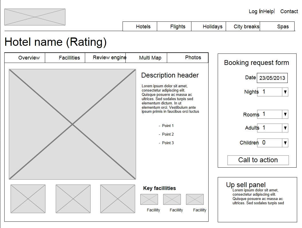
Wireframe of Website Organization
Rationale for Organization
I chose this wireframe because it clearly shows the contact information, phone number and address, in the top right corner so everyone who comes to my website will be able to find it. Also, the name and picture of the resort are the most prominent features of the page. These are both very important to the resort's success and as such I wanted them to be the most important part on the website. The main page will also include links to amenities, photos, and pricing (this will replace the maps section). Any question a person could ask about the resort will have an answer in an easy to find tab on the homepage. Ease of use for the customers is the most important aspect of this website.
Media
I will be using pictures of the resort, both inside and out. The current owner has the copyright to pictures of the resort which they are allowing me to use and I also have the ability to take my own pictures at the resort as needed for the website.
Color Scheme
The general idea I have for the color scheme of the website is to mimic the lake water, beach, and possibly sun or sunset. I chose this because the resort is at a lake and so I want the online version of the resort to mimic the real resort. This means using a blue, a gold, and possibly an orange or pink. The colors are shown in this page. The H1 header is the blue, the H2 headers are orange, the H3 headers are pink, and the text of the body is the gold.